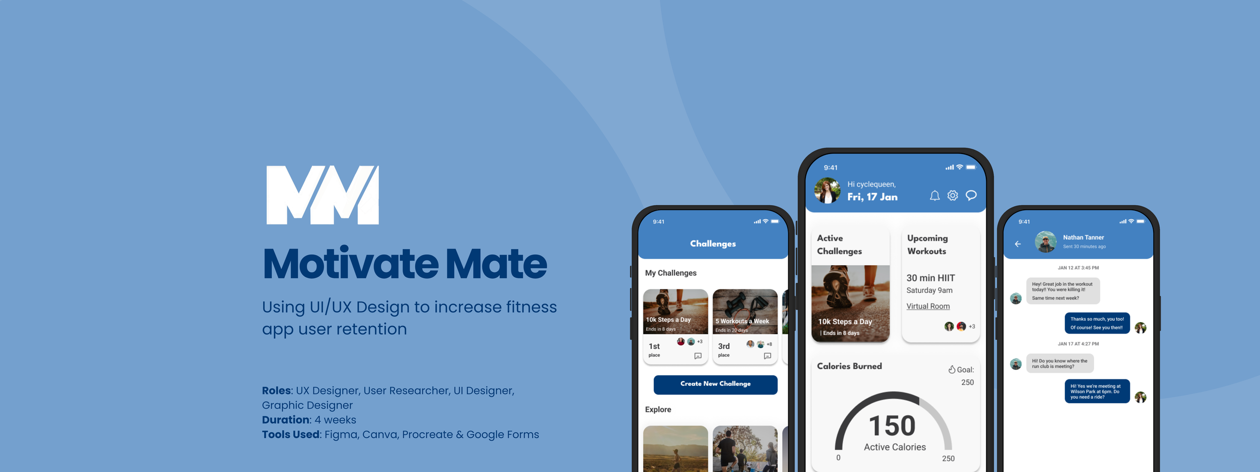
Overview
A fitness tracking app company noticed users who downloaded their product were highly motivated in the beginning, but that motivation typically died off after the first 3 weeks and users ended up deleting the app.
Problem
In order to make users feel connected to and encouraged by their friends and family while using the fitness tracker app to help with user retention, I designed an integrated messaging experience for the product to help drive engagement and repeat usage.
Solution
Company Brand
The company’s brand attributes are trustworthy, contemporary and humorous, which all led to the name, Motivate Mate.
Blue was used as the main color because it is reliable and trustworthy. League Spartan was chosen for the bold / modern headers and Roboto was chosen for the open and easy to read body text.
Research & Define
Competitive Analysis
In order to better think through a design solution, I started by studying the leaders in the fitness industry and seeing how they keep their users engaged.
User Interviews
After studying the current industry leaders, I decided to conduct user interviews to complete the user research for Motivate Mate. This method would be used to help identify users' needs directly from users themselves.
From these interviews, I learned that users like to workout and track their stats for a variety of reasons. Whether it is to achieve a fitness goal or work towards a healthy lifestyle overall, users like to keep track of these activities and know if they are making progress towards their goals.
And while all users might be tracking their health and fitness stats for a variety of reasons, all users had similar feelings in regards to accountability buddies and working out with their friends - it helps them be more consistent and pushes them to be better.
Key User Quotes:
“Working out with others helps me be more consistent.”
“It’s hard to be accountable to myself.”
“Working out with friends and family pushes me.”
“Working out with others sparks competition… makes me feel like I need to work harder.”
Research Synthesis
During the affinity mapping exercise, I was able to split the key takeaways from the interviews into various categories such as: accountability, competitions, social interactions, and reasons for tracking health stats.
The main takeaways from each category led me to the following themes:
Users like to track their health fitness stats to work towards an overall goal and feel more accomplished.
Working out in group settings or with friends helps:
Keep users accountable
Increase users’ competitive drive
Users feel more encouraged through social interaction.
Since the overall business goal for this project is a way to increase user retention, I focused the design on the competition, accountability systems and social interaction/encouragement aspects to help encourage users to be more involved with the app.
Initial App Design
User Flows
The red routes listed below are the main flows that users would follow when using this app and provided the basis for the initial sketches.
Setting up profile
Starting challenge
Adding a friend
Viewing feed
Scheduling virtual workout
Sketches
Wireframes
The Inbox and Messaging pages were designed based on popular social media platforms because many users mentioned using social media to stay connected with their friends and family and spend multiple hours on social media a day.
The Feed and Notification pages were also designed similar to social media platforms.
The Home screen has widgets that show specific fitness information that is being tracked.
Note: This feature was not a part of the scope of this project, but it could be enhanced to be more customizable in the future.
Usability Testing
This round of usability testing was completed with low fidelity wireframes. I tested 3 participants and they all had positive experiences with using the app!
Users would like to be able to message their friends directly from the Notification screen.
Users identified a gap between the Workout screen and the Inbox to message their friends to see if they were still attending the workout.
Users also experienced some confusion on the Challenge screen (not sure what the customization options were).
Key Takeaways:
Final Design Solution
High Fidelity Prototype
Using the feedback from the first round of usability testing and the brand guide I had previously created, I designed the high fidelity prototype to give users a more realistic idea of how the app would function in the real world.
Final Design Validations
Another round of usability testing was completed with the high fidelity prototype. I tested 5 participants, who all described the app as simple, fun and encouraging.
Users would like to be able to go straight to their Inbox in order to message their friend to see if they are still coming to the workout.
The screens that the icons on the bottom tab bar represented were not clear to all users.
Key Takeaways:
Based on this feedback, I updated the Inbox screen and added labels to the bottom tab bar.

Conclusion
Future Considerations
Conducting another round of usability tests to validate the updates made to the prototype.
Tracking the user retention rate after the messaging features go live.
Beginning to look into the fitness tracking features on the app and conducting user testing to better enhance those features as well.
If time allowed, the next steps would include:
Being tasked with working on one specific feature of a larger app initially sounded more daunting than working on the overall app itself! However, once I narrowed the scope, I was able to tailor and focus my research in order to get the necessary information I needed to create not only a messaging feature, but also a way for users to challenge and workout with their friends from the comfort of their own homes.


